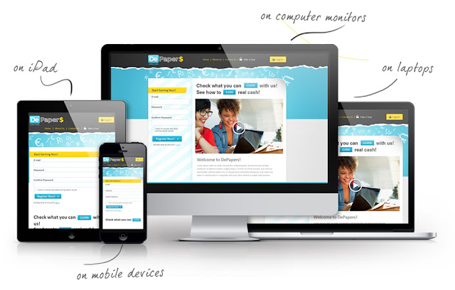
Is your website mobile-friendly? Build a mobile-first responsive website design and get more customers and revenue, because every customer counts.
Originally we only surfed with computers, but today 70 percent of online traffic is via smartphones or tablets. And that has consequences for web design. Creative Peppers Inc underlines the importance of a mobile-first responsive website below.
WHAT IS RESPONSIVE WEB DESIGN?
To meet the growing number of mobile surfers, web designers started with the development of dual websites: one for devices with a large screen and a separate, mobile website for devices with small screens.
These mobile sites were specifically designed and programmed to make optimum use of the smaller screens and the less accurate touch screens.
The development and maintenance of two separate websites is a time-consuming activity. That is why web designers now only code one website, the layout of which automatically adjusts to different screen sizes. In short: the look of the website depends entirely on the type of device on which the user views it.
Do you visit the pages on a large computer screen? Then you get to see the entire site with all elements, images and a navigation that is fully visible. If you visit the same site from a smartphone, non-essential elements are hidden or reduced. This simplifies navigation through the website.
This way of designing is called 'Responsive Web design'. In other words, dynamic layouts are used that adapt smoothly to screen sizes.
WHAT IS MOBILE FIRST?
Originally, Responsive Web design worked according to a top-down philosophy, whereby the fully-fledged desktop sites were stripped for mobile devices. Although this simplification brought practical problems. Heavy files also delayed downloading the site on mobile devices.
Given the evolution towards more mobile devices, it was, therefore, wiser to ultimately work with a bottom-top approach. This method was given the name Mobile First. Below you will find some advantages of developing your website according to the Mobile-First method.
KEEP THE CONTENT INTACT
A website consists of 90 percent content. Regardless of whether it is about images, video, texts, graphics or dynamic GIFs. On a desktop or laptop screen, you have a lot of room to place this content, but the same layout is usually not ideal on mobile screens.
A mobile-first approach ensures that you are more careful when planning your content so that the important messages are visible first. When scaling up to larger screens, it is then easy to position that content well there too.
BETTER NAVIGATION
When you clutter elements of a desktop site into a mobile screen, there may be many aspects that are detrimental to the design. For example, think of texts that no longer fit on the screen. Or images that suddenly take over the entire screen.
The challenge is to fit as much as possible on a small screen. So you think better based on that limitation. After all, it is easier to extend a compact, simple structure upwards than to simplify a complex structure.
CUSTOMER SATISFACTION
The ultimate goal of every website is to increase the number of page visits. Whether it's click from a laptop browser or a browser on a smartphone. But load a heavy, compressed page on a mobile device? Well, that causes friction with visitors.
An optimized and mobile-friendly website, on the other hand, ensures a worry-free experience. And helps to increase your page views.
BE READY FOR THE FUTURE
The world has already evolved into smartphones. And other screens and platforms are already on the horizon, such as smartwatches and Virtual Reality (VR).
According to analysts, the heyday of the traditional PC is behind us and the world now belongs to mobile devices. With a mobile-first strategy, you are already prepared for all the screens that are still to come.
FOLLOW THE MONEY
Facebook explained that in 2015 no less than 80% of their advertising income came from mobile. Due to the increasing mobile use, advertisers have also switched to mobile platforms in large numbers.
It will not be long before the advertising budgets for mobile have exceeded those of the desktop and laptop market.
KEEP MANAGEABLE
In the past, web designers built a complete, detailed website for stud users. Only then did they make a stripped version for mobile users.
Now you can start as a designer with a mobile version of the website on which all important information is already present. This site can then systematically make you more advanced for users on traditional computer screens. Since the majority of visitors come via mobile, you can already quickly welcome this target group.
TRY TO STAND OUT
In 2015, Google also announced that they received more searches through mobile devices than through traditional computers. It therefore also introduced a new system called Accelerated Mobile Pages (AMP).
That system ensured that pages are loaded faster on mobile networks and use less bandwidth. Another innovation came with Mobilegeddon, an algorithm that ranked mobile-friendly websites higher than sites that are not mobile optimized. With a mobile-first strategy, you ensure that your search results at Google improve.
Users are impatient and often have an arc of attention for a few seconds. They want quick results. Thanks in part to sites such as Google, the expectation has been created that everything should go supersonic. Even to the millisecond.
A website that cannot give its visitors what they are looking for quickly enough loses customers. And which case does this want to risk?
Do you want to make your website responsive according to the mobile-first principle? Then contact Creative Peppers Inc, a full-service Austin digital marketing agency for the digital visibility of companies.

Comments
Post a Comment